Business Insider Ads Redesign

Advertising
Project Overview
When I joined Business Insider, one of my first priorities was redesigning the company’s custom ad offerings. The creative platform supported rich media, but the visual execution felt cluttered and inconsistent. I started by refining the foundations — simplifying layouts, improving legibility, and introducing more intentional white space to create a cleaner, more modern system.
Establishing a clear distinction between branded and native ads
From there, I dug into the structure of BI’s ad ecosystem. The offerings spanned content-driven and video-driven formats, each with multiple destinations: some drove to advertiser sites, others to BI editorial content, and some supported in-house Studios productions. Despite these different user journeys, the ads all looked the same. I saw an opportunity to make the UI reflect intent. Ads driving to external advertiser sites became more distinctly branded, while those leading to BI content borrowed visual cues from BI’s editorial design. This differentiation clarified the experience for users and aligned the ad presentation with its destination.
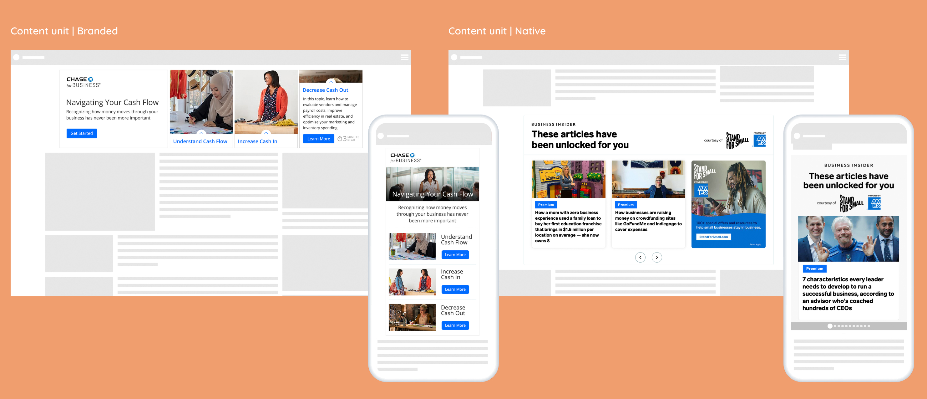
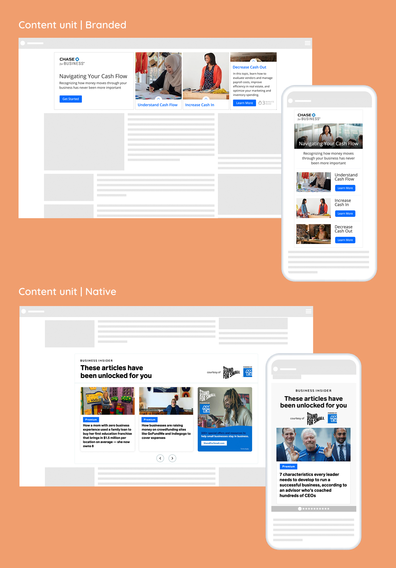
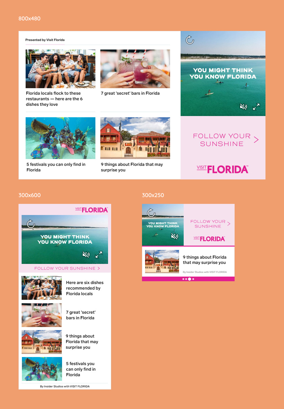
Consistency across formats
It was also important that the design layout be flexible across different ad sizes. I was striving for a consistent look so that the ads looked like a cohesive product. I appreciated the autonomy this project allowed — it felt like returning to design fundamentals: hierarchy, spacing, consistency, and clarity. Iterating on layouts within an existing product system was both challenging and satisfying, and the cleaner end result elevated the overall quality of BI’s ad platform.

Want to get in touch?
Drop me a line!

Thank you! Your submission has been received!
Oops! Something went wrong while submitting the form.